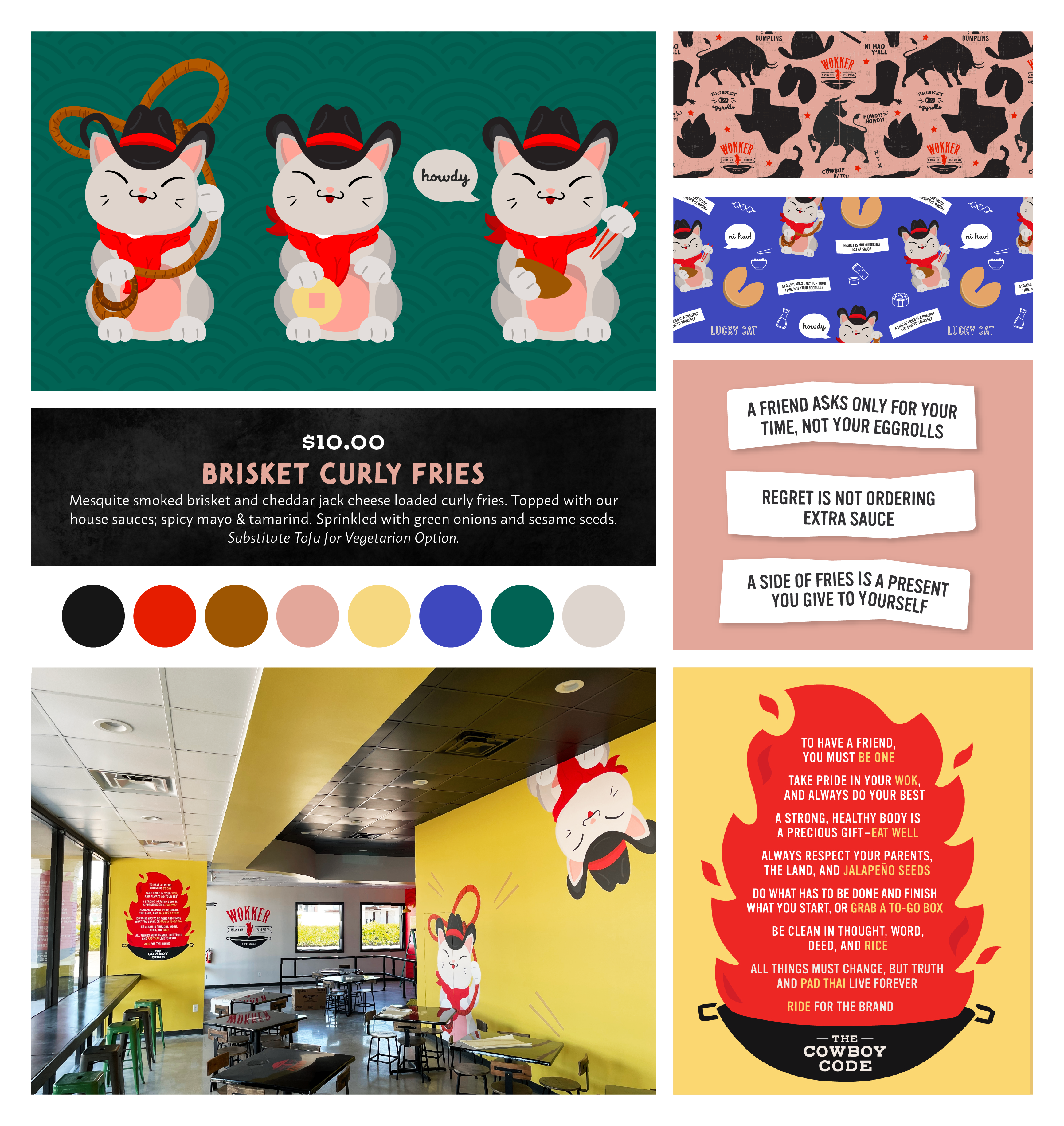
When the guys from Wokker decided to take their multi-unit, successful food truck business into its first bricks-and-mortar they needed to extend the brand. We updated their logo and tagline and then developed a brand system and messaging to bring the their existing personality to life in a physical space.
Brand Identity Brand-to-Space Design Messaging Art Direction
Inspiration
The Pathways for Little Feet brand concept is rooted in the history of speakeasies and speakeasy terminology. The finch has no eyes. He’s blind so that he does not see who or what happens in the bar. He is the protector of the secrets of the place, and turns a blind eye to the revelry that happens there, while ensuring no one gets out of line. He is strong and aggressive as a protector, but passive in his engagement with customers and prefers to stay
in the shadows.
Color Palette
The color palette is inspired by the Greek coastal town of Aigio, where BMBC founder grew up. The blues speak to the ocean and sky, and the bronze to the golden, sandy beach. In combination with muted neutrals, the color palette has an old-world charm with modern sophistication.