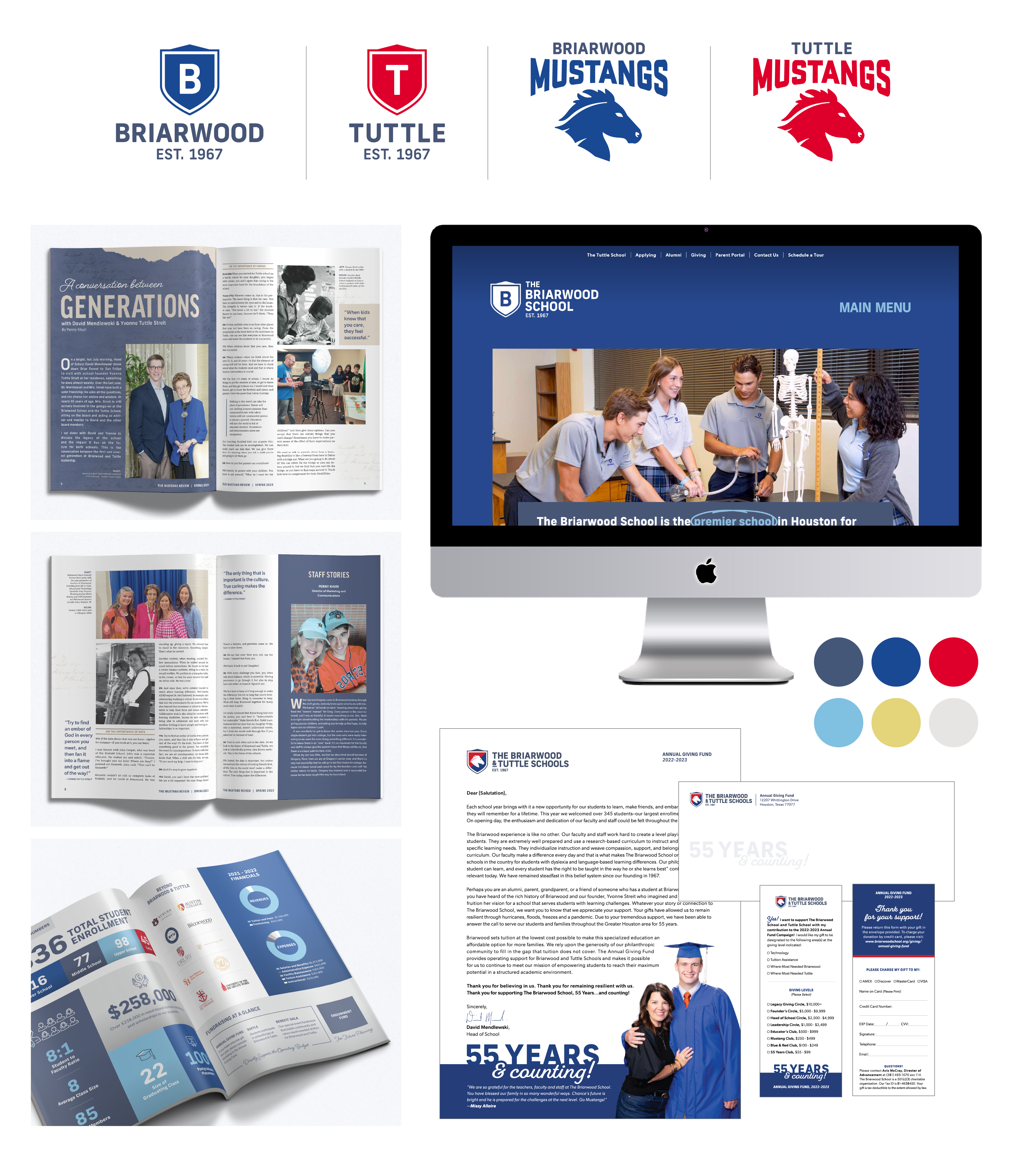
The Briarwood and Tuttle Schools came to us to execute a rebrand after 55 years of operation under various disparate logos. We needed to create a system that would better align the two schools while maintaining individual identities for each, as separate but equally-important parts of their educational program.
Deliverables
Brand Identity Website Publication Design
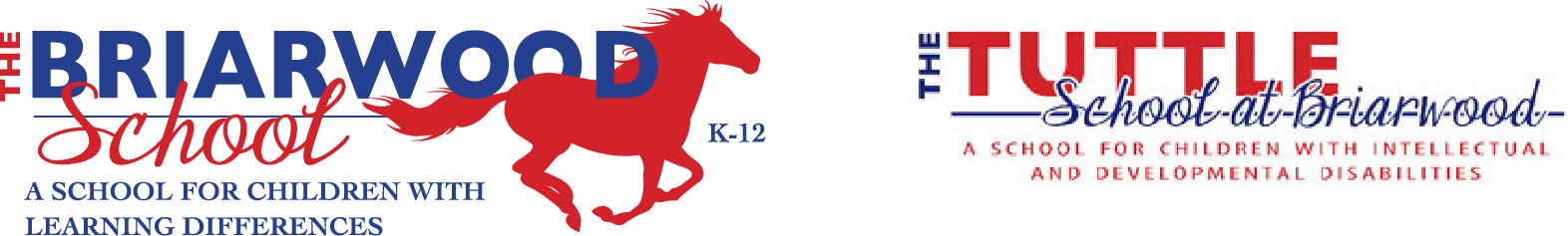
Before
After
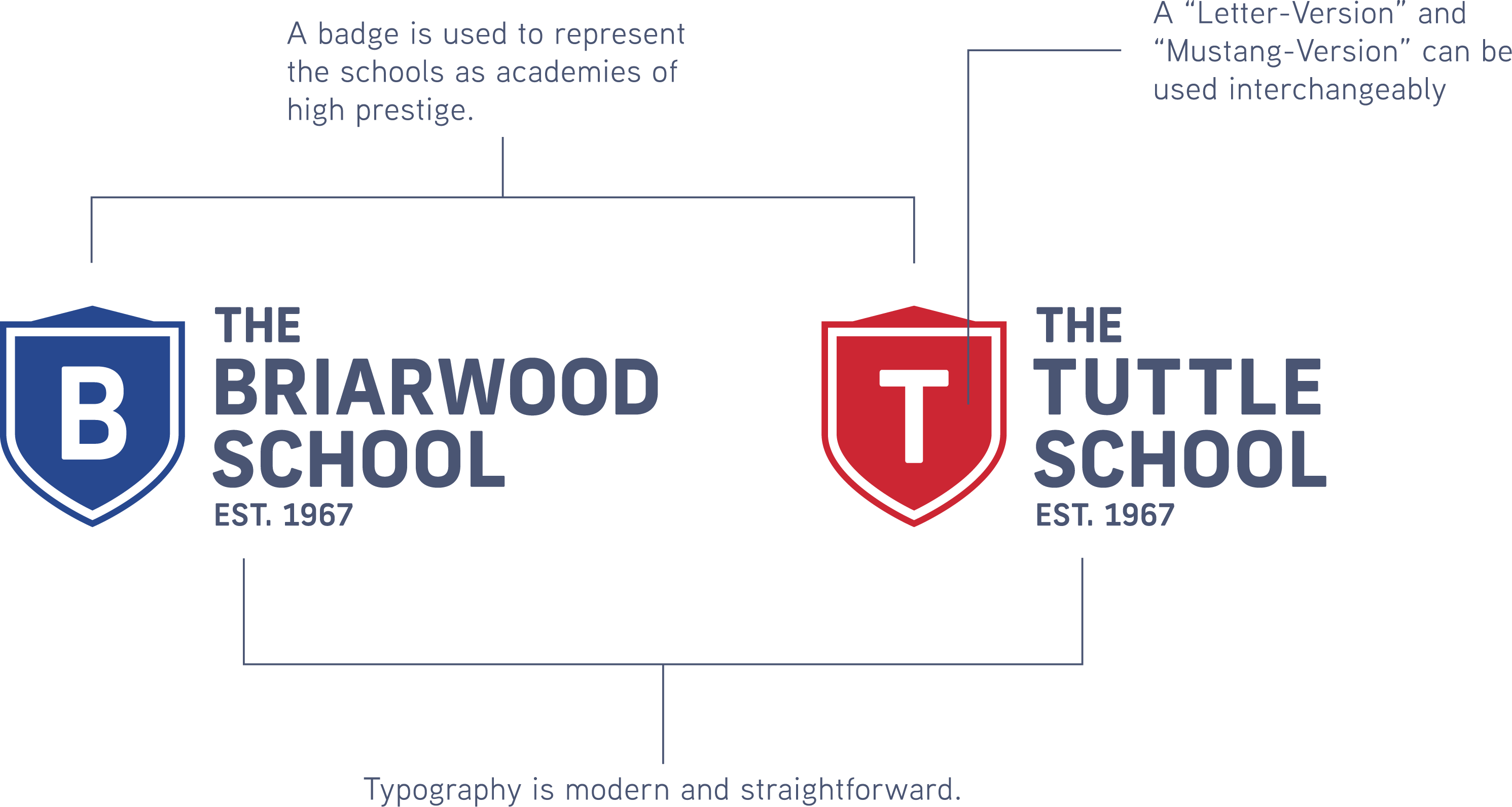
Logo Anatomy
The Briarwood and Tuttle School brands focus on traditional academic symbology of seals, with a more modern approach than traditional coats of arms style marks. Updating the mustang icon to a more modern bust style, differentiates from the plethora of traditional "running mustang" logos. Given the history of the school and loyalty of current and former students and staff, respecting the past while moving toward a new brand "face" was paramount.
Once the new brand was solidified, we were tasked with streamlining the design and user-experience of their websites. The sites are extremely information heavy, and needed to educate and qualify potential students as smoothly and easily as possible, while also allowing for near constant updates of content, events, and images.
Finally we designed a completely new approach to their bi-yearly magazine, highlighting everything from financials to student and staff achievements for the semester, in a more engaging and editorial style.
Color Palette
The primary color palette for The Briarwood and Tuttle Schools was derived from their already-existing brand, which combined the use of blue and red.
But as both schools needed to operate individually while being housed in the same campus building, we split the use of blue and red amongst them. This allowed each school to form its own identity, while remaining flexible in shared campus spaces already featuring the use of blue and red.
To develop each brand further, a complementary secondary color palette was developed, informed by readily available third-party merchandise. Primarily, we made sure the secondary palette was available in the brand of uniforms the schools utilized so that the students could build a sense of school pride through apparel and branded garb.