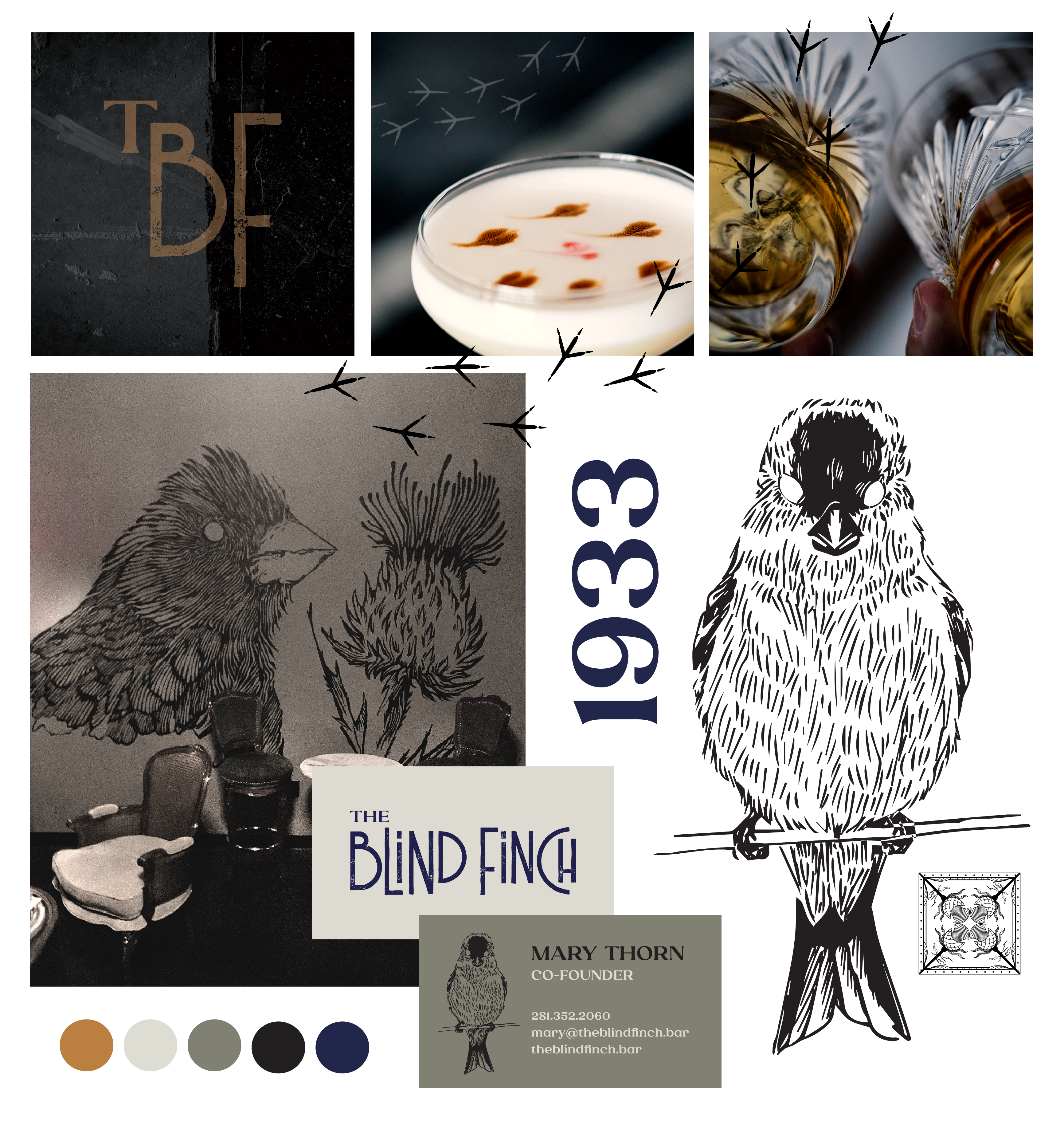
The second project for an existing client, The Blind Finch is the polar opposite of their first venue, Thistle Draftshop, located next door. The Blind Finch name riffs on the “blind” references of prohibition era speakeasies, while referencing the symbiotic relationship between finches and thistles. A throwback to traditional speakeasies, focused on traditional design queues with a modern twist.
Deliverables
Naming
Brand Identity
Brand-to-Space Design
Website
Art Direction
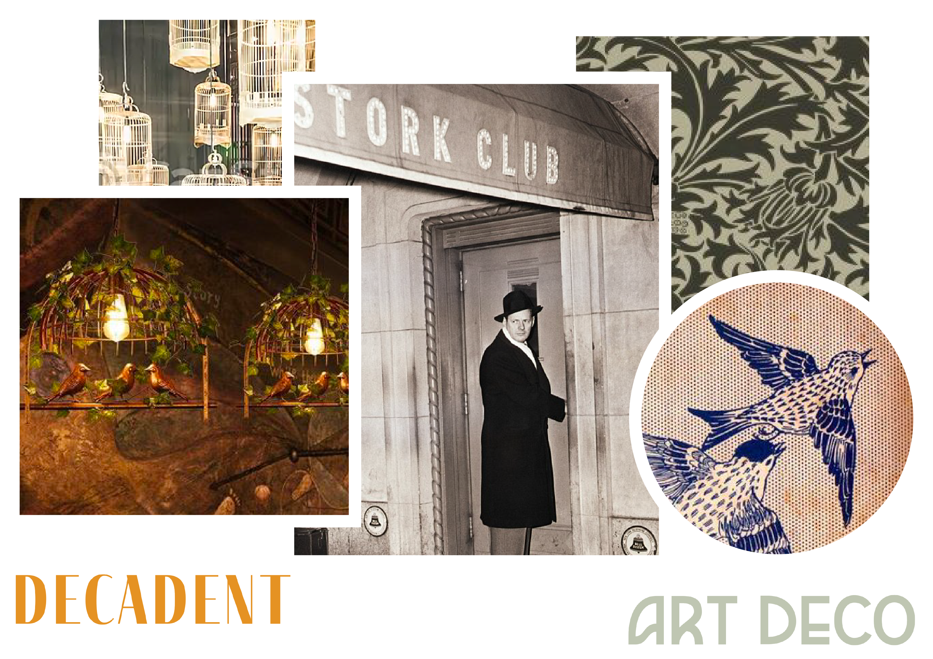
Inspiration
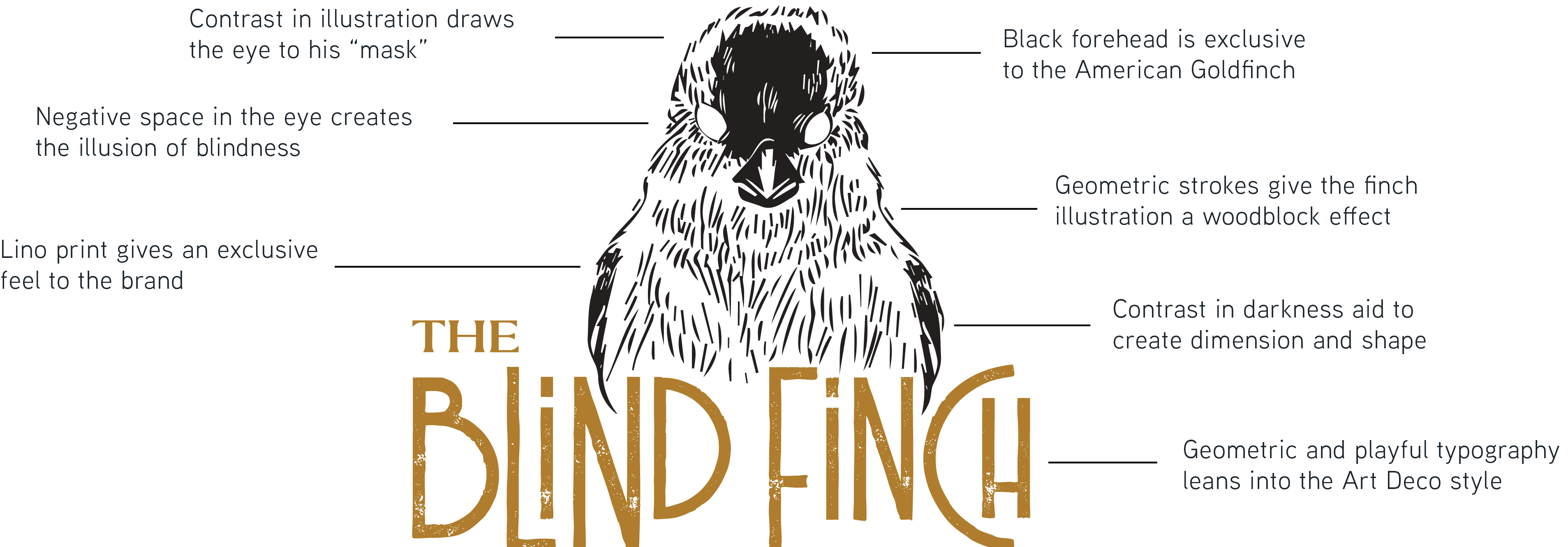
Logo Anatomy
The Blind Finch brand concept is rooted in the history of speakeasies and speakeasy terminology. The finch has no eyes. He’s blind so that he does not see who or what happens in the bar. He is the protector of the secrets of the place, and turns a blind eye to the revelry that happens there, while ensuring no one gets out of line. He is strong and aggressive as a protector, but passive in his engagement with customers and prefers to stay
in the shadows.
Color Palette
The Blind Finch color palette was inspired by a core set of rich jewel tones and vintage neutrals.
"They had the skillset of a visionary and the ability to extract ideas from their clients."