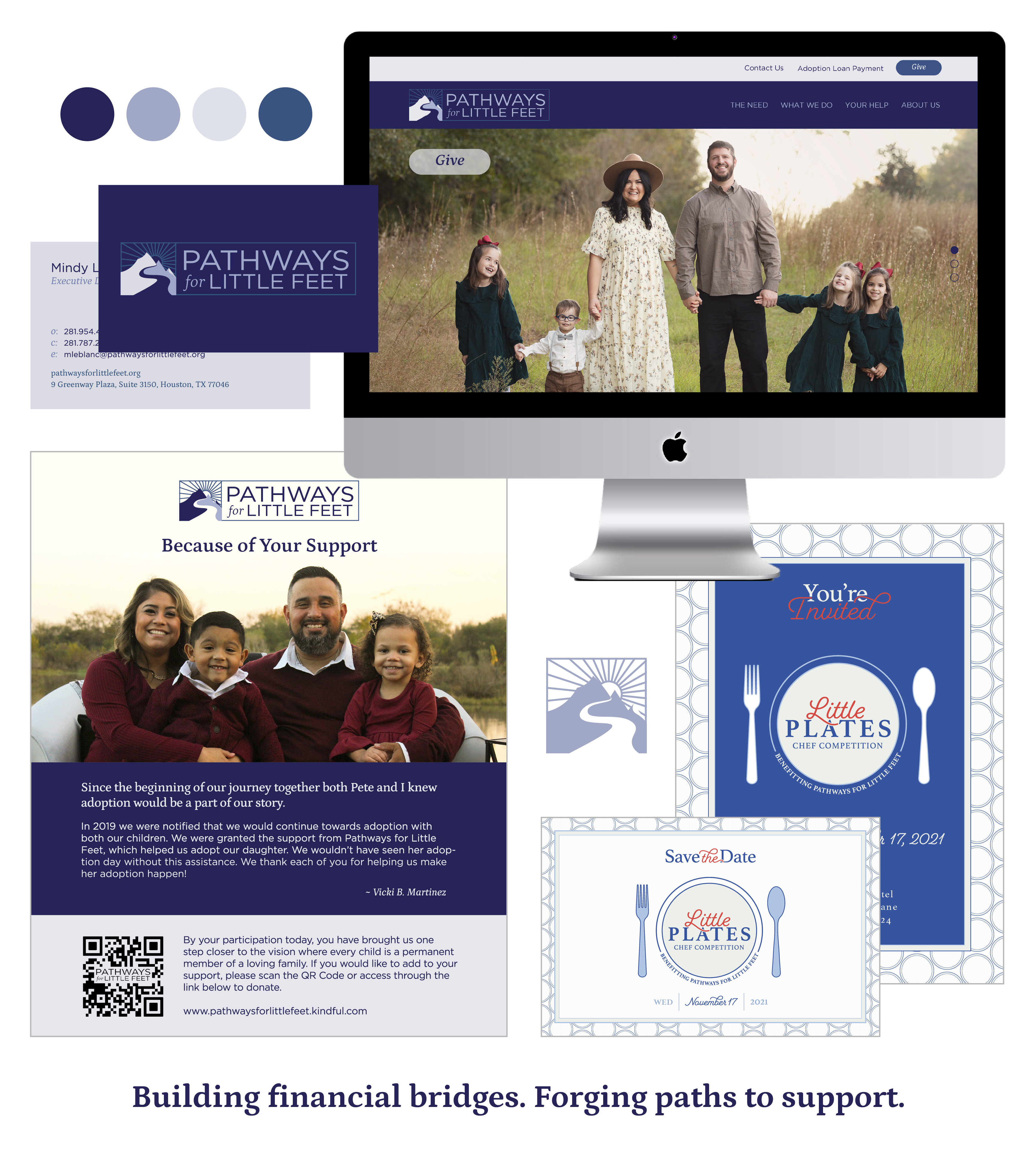
After 7 years of managing the original Pathways for Little Feet brand, growth and diversification of the services they provide and audiences for those services necessitated a re-brand. We developed a new identity to better align with their origin story as well as an updated tagline, mission statement, and website.
Brand Identity
Messaging
Print Design
Digital Design
Website
Event Design
Inspiration
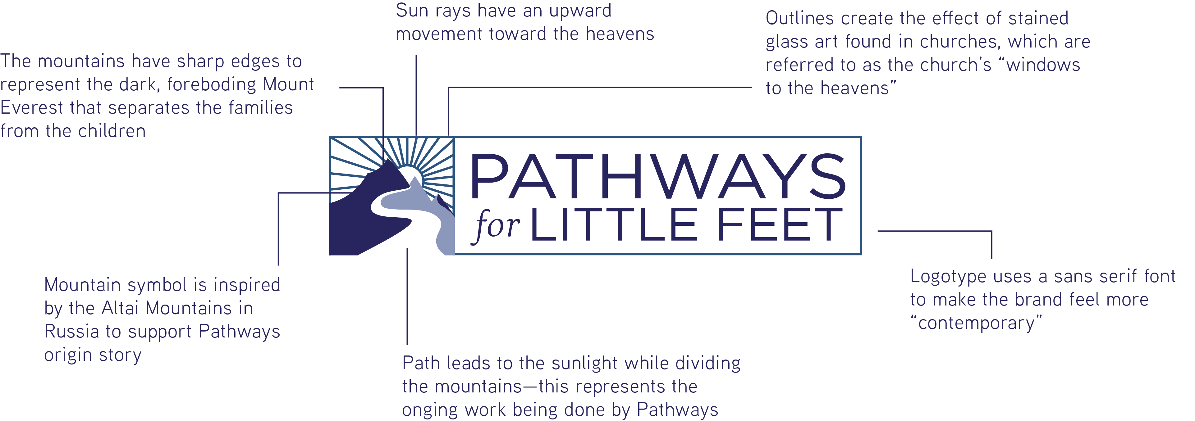
Logo Anatomy
The Pathways for Little Feet brand concept is based on an analogy of the current adoption and foster care landscape often used by founders Kerr and Jill Taylor.
On one side of a giant mountain are thousands of children in need of homes and on the other are potential parents waiting to greet them. They remain separated because of financial or support challenges that Pathways for Little Feet works to solve. The path that PFLF forges helps lead to the "light" of these two groups being united into happy, well-adjusted families. We continue to support the Pathways brand and messaging in their ongoing effort to adapt to the everchanging landscape of adoption and foster care in the U.S. and internationally.
Color Palette
The Pathways for Little Feet color palette
has been developed around colors that
represent trust, calm, creativity,
peacefulness and tension relief.