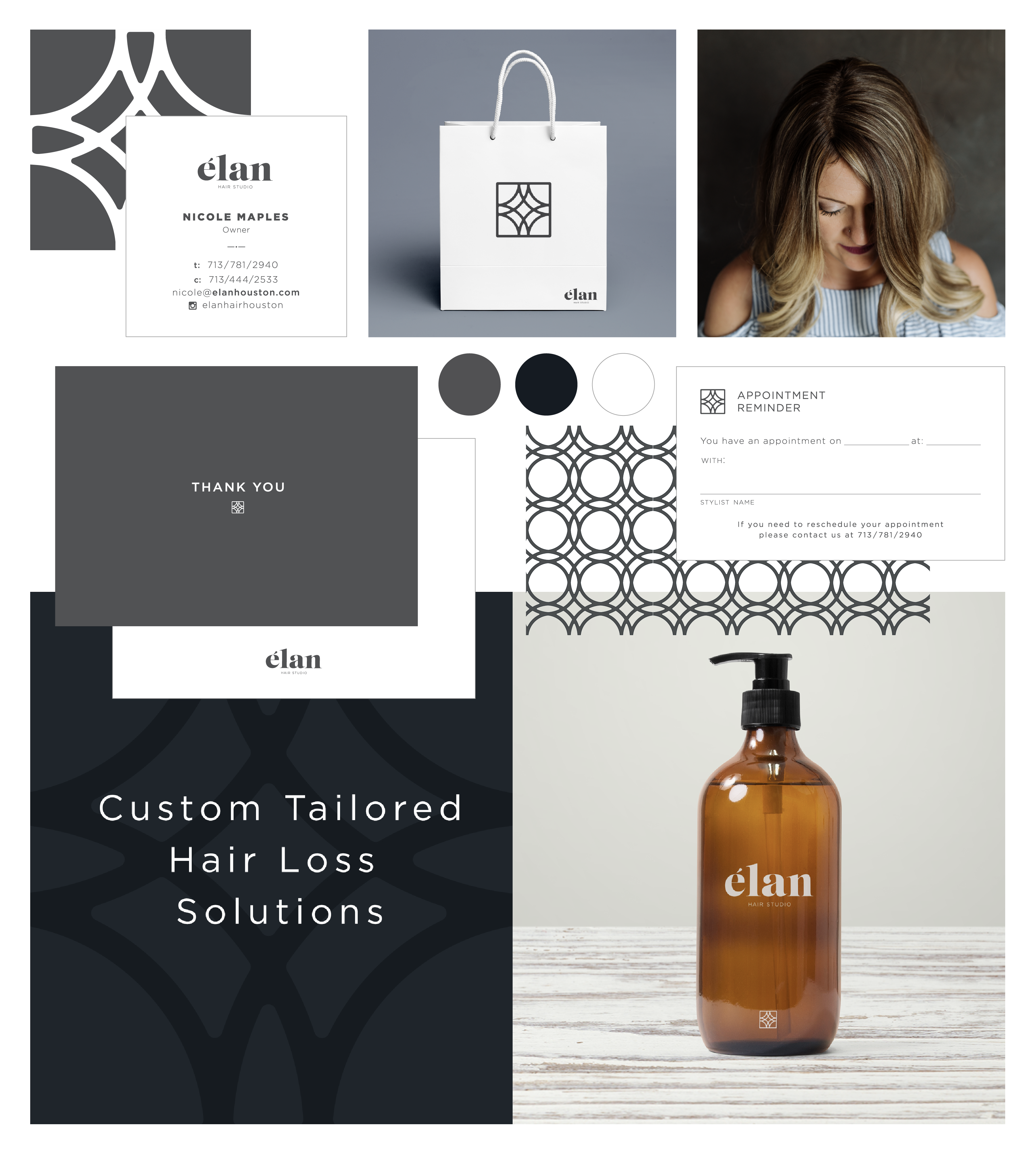
Recognized with an AMA Crystal award, our task was to rename and re-brand an established hair restoration studio to be more sophisticated and appealing to a younger, particularly female audience. The name élan means “energy, style, and enthusiasm”, all the qualities that are challenging when experiencing hair loss, and are restored along with a client’s hair. The brand follows suit with elegant letter forms and dynamic patterns.
Deliverables
Naming
Brand Identity
Messaging
Website
Inspiration
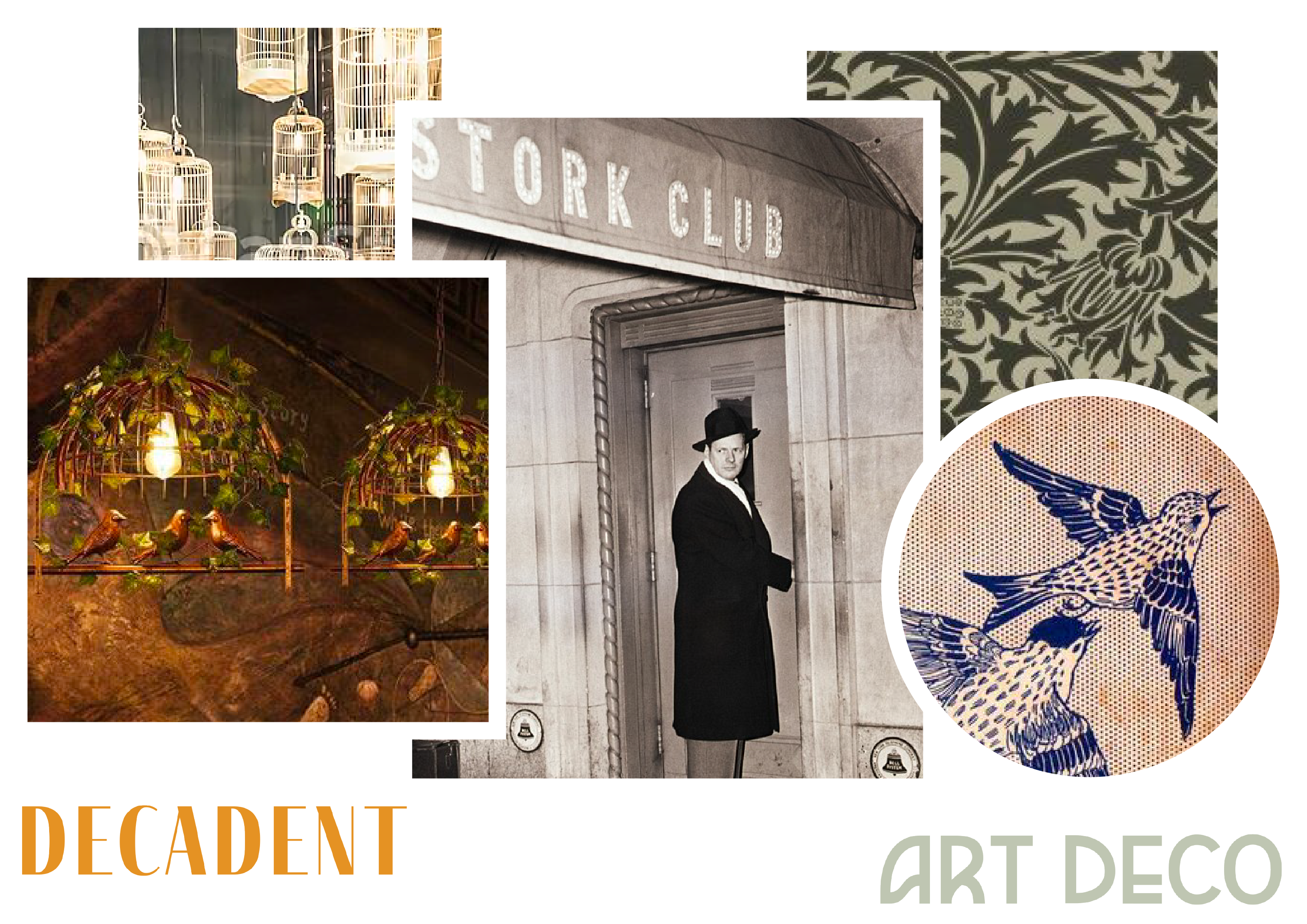
The Blind Finch brand concept is rooted in the history of speakeasies and speakeasy terminology. The finch has no eyes. He’s blind so that he does not see who or what happens in the bar. He is the protector of the secrets of the place, and turns a blind eye to the revelry that happens there, while ensuring no one gets out of line. He is strong and aggressive as a protector, but passive in his engagement with customers and prefers to stay
in the shadows.
Color Palette
The Blind Finch color palette was inspired by a core set of rich jewel tones and vintage neutrals.
"Primer Grey is a crucial part of my team, not just a vendor I work with."