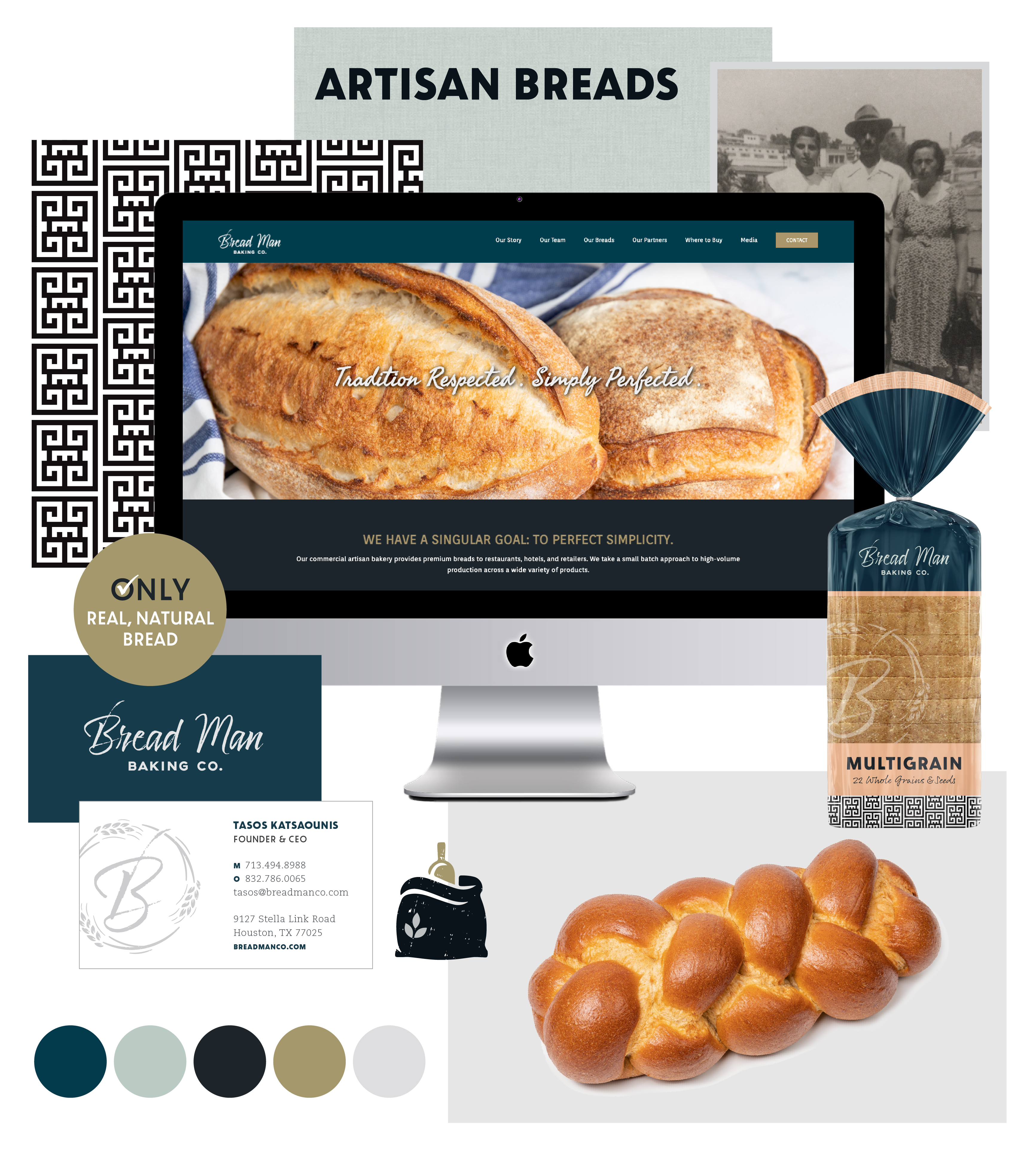
As Breadman Baking Co. prepared to grow their facilities by 400% and their distribution nationally, they needed a stronger brand. Focused on pulling in more of the founder’s Greek roots and familial influence on the business, created a more cohesive identity, all of which helped to secure $2M in funding and dramatic growth in retail distribution.
Deliverables
Brand Identity
Messaging
Website
Art Direction
Packaging Design
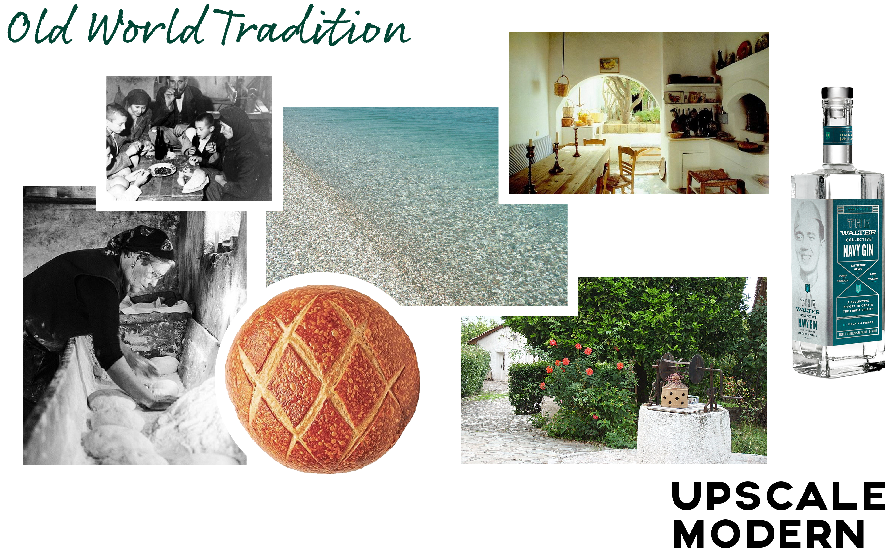
Inspiration
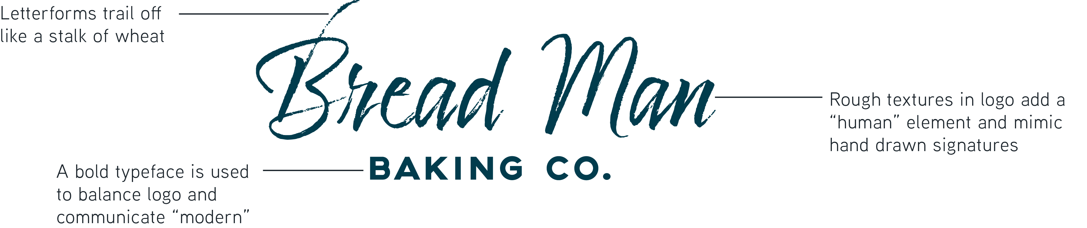
Logo Anatomy
Tasos Katsaounis, affectionately known as the Bread Man by his children and now countless customers, learned to bake in his grandmother's kitchen. The family created fond memories spending summers in Greece surrounded by delicious food and bread. With the Bread Man Baking Co. brand, we looked to pull in as much of this history and culture as possible. The color palette is borrowed from the beautiful beaches, while a custom BB Greek key pattern points to tradition. The tagline references both Greek foodways, as well as Tasos' approach to baking... water, salt, flour, yeast... "Tradition Respected. Simply Perfected." Additional deliverables included a custom website and a packaging design system.
Color Palette
The color palette is inspired by the Greek coastal town of Aigio, where Tasos, the founder grew up. The blues speak to the ocean and sky, and the bronze to the golden, sandy beach. In combination with muted neutrals, the color palette has an old-world charm with modern sophistication.
"They loved our project because of the nature of our business and our story."